System Icons
Our system icons are timeless. They are mostly seen on our website and app, but can be used anywhere. Rely on them when words are not enough.


Follow the grid
Our icons are carefully designed following a grid. All icons are drawn on a 24x24px grid frame, with a 2px stroke width for outlines. Each frame includes keylines and a 1px padding on all sides as guidance. It’s acceptable to go beyond the padding or off the keylines if this will improve the balance of an icon. If you need of a new icon, follow the guidelines on our Figma doc, or make a request to the design team.
Illustrative Icons
Sometimes you need a little bit more detail. Our illustrative icons add pizazz to any design and help explain concepts and ideas. Use them in infographics, presentations, and landing pages.

It's all about the details
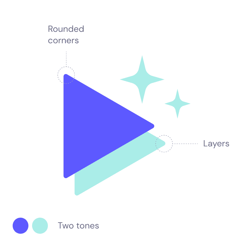
While there are no strict grids to this set of icons, there are a few golden rules for consistency.
Use two tones. To keep the icons simple and clean, choose two main colors to work with (from our brand color palette, of course). You can use their lighter/darker tones for details such as texture.
Play with layers. To give more volume and depth to a illustrative icon, play with more than one layer, using different colors to create a contrast.
Always rounded corners. They make our icons more friendly and match our brand look & feel.